I like the BW version. It gives an aged effect. Reminds me of some of the chapels I have seen in Ireland and France. Is that a chapel behind that door?
I like the black and white best. While the red really pops, I'm distracted by the glare on the varnish and the angle of the edge of the door. If it were straighted so the edge was verticle and the glare could be eliminated then I think I'd like the red for it's geometric boldness, but in the retouched version I think the angle works with the image. It's nice to see the two options side by side.

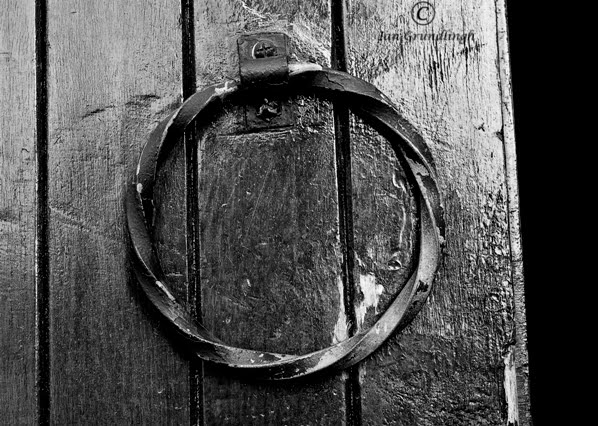
The retouched is my favorite of the two...nice tones...and it takes away the distractions the color shows off..NICE!
ReplyDeleteI like both versions - the b&w is impressive but then I love red, so I can't decide. But, what's behind the door? I think it's a privy.
ReplyDeleteI like the BW version. It gives an aged effect. Reminds me of some of the chapels I have seen in Ireland and France. Is that a chapel behind that door?
ReplyDeleteLove the retouched version! Really brings out the texture of the wood and the iron. I think it is a barn door handle!
ReplyDeleteThe black and white version is much better. It hides the imperfections of the door. Good image.
ReplyDeleteI like the black and white best. While the red really pops, I'm distracted by the glare on the varnish and the angle of the edge of the door. If it were straighted so the edge was verticle and the glare could be eliminated then I think I'd like the red for it's geometric boldness, but in the retouched version I think the angle works with the image. It's nice to see the two options side by side.
ReplyDelete